
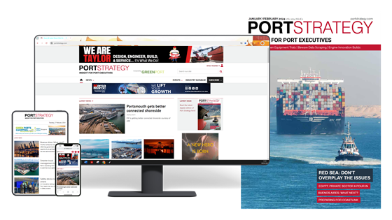

GreenPort Congress has a fresh, new look website which has been re-engineered to incorporate ‘responsive design’.
This move will ensure the best possible display of content on any device, regardless of shape or size. It will also make it easier for readers to view content and navigate around the site to quickly find what they want, as well as improving response rates for advertising clients. The investment underlines Mercator Media’s commitment to continually improving and developing its online information products.
‘Responsive design’ allows website contents to be optimised for best viewing on all screen sizes and resolutions, from desktops and laptops to tablets and smart phones. The website recognises the reader’s device type and adapts the text size, navigation and lay-out, as well as the size and positioning of the display advertising.
“The number of visitors to our websites from tablets and smart phones has risen considerably in the last year,” said Andrew Webster, Managing Director of Mercator Media. ‘The purpose of this investment is to make sure we provide our readers and advertisers the very best of new technology to help them with their businesses”.
“The new designs and layouts were developed in response to our ongoing audience research. Also, print, on-line and eNewsletters are integral parts of each of our magazine brands and need to reflect a common look and feel which is constantly evolving”.
For Mercator Media’s magazine websites, go to: http://www.mercatormedia.com/our-markets
For Mercator Media’s event websites, go to: http://www.mercatormedia.com/our-business/events
