





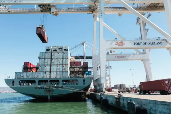
Green Port gets responsive
Mercator Media has made another significant investment in its online offering and redesigned the ‘Green Port’ website to incorporate ‘responsive design’.

The development will ensure the best possible display of content on any device from desktops and laptops to tablets and smart phones.
From now on, when a visitor clicks onto the website, device type will be recognised and text size, navigation and layout, as well as the size and positioning of the display advertising, will adapt accordingly.
Mercator’s investment results from a demand for a more up-to-date user experience as well as improved response rates for advertising clients.
Andrew Webster, managing director, Mercator Media, said: “The number of visitors to our website from tablets and smart phones has risen by 90% in the last year. The purpose of this investment is to make sure we provide our readers and advertisers the very best of new technology to help them with their businesses.”
Design and layout fr all of Mercator’s titles is continually monitored next to ongoing audience research. “Print, online and eNewsletters are integral parts of our magazine brand and need to reflect a common look and feel which is constantly evolving,” Mr Webster added.
Try out Green Port’s new responsive website design for yourself.
Related Articles
 EQUIPMENT
 ALTERNATIVE FUELS GREENPORT